Blog
Creating a Cohesive OnlyFans Aesthetic: Colours and Editing
How a small colour palette, one editing style and a planned feed give your OnlyFans page a recognisable look, and why that can make your prices feel fair.
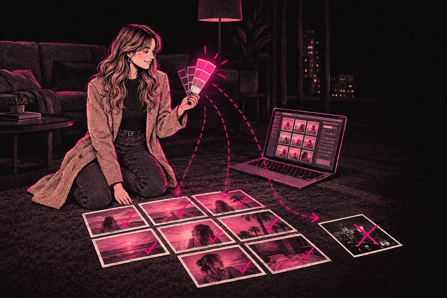
A cohesive OnlyFans aesthetic comes down to a few choices you repeat: a small set of colours, one editing style, and lighting and settings that look like they belong together. Make those choices on purpose and keep making them, and your feed starts to look like one page instead of a pile of separate posts.
It doesn’t have to be perfect. What matters is that people can recognise it and it looks deliberate.
What aesthetic means in this context
On OnlyFans, your aesthetic is the overall look of your page. That’s everything a subscriber sees: the colour tones in your photos and videos, how you edit them, where you shoot, what you wear, and how the feed looks when someone scrolls through it all at once.
Think of it as the visual side of your voice. Your personal brand covers how you talk to fans and what you stand for. Your aesthetic is how that looks on screen.
Why a cohesive aesthetic matters
Perceived value
A page that looks put together comes across as more professional. You don’t need expensive kit or a studio for that. You need posts that look like part of the same set. That can make a higher subscription price, or a higher PPV price, feel fairer to a fan deciding whether to pay.
If you’re working out how your look fits with your prices, try our pricing tool.
Subscriber retention
When your posts share a look, subscribers start to link those visual cues with you. Over time they’ll know a post is yours before they see your name.
Promotional impact
When you share previews or teasers on social media, a recognisable look makes your posts easier to spot in a busy feed. Followers on Twitter or Reddit can start to recognise your posts before they read the caption.
Feed curation
OnlyFans shows your posts in date order, but subscribers do scroll back through them. When the feed hangs together, scrolling back feels like looking through one collection.
Building your colour palette
Colour does a lot of the work. It sets the mood, says something about your personality and ties together content that’s otherwise quite varied.
Choosing your colours
Start with the feeling you want your page to give off.
- Warm tones (golds, ambers, soft oranges, warm pinks) feel intimate and sensual.
- Cool tones (blues, silvers, soft greens) feel calm or a little mysterious.
- High contrast (deep blacks, bright whites, bold reds) feels dramatic and intense.
- Pastels (soft pinks, lavenders, baby blues) feel playful and approachable.
- Earth tones (tans, warm browns, muted greens) feel natural and down to earth.
You don’t have to stick to one colour. A simple palette is usually two or three main tones plus one or two accent colours.
Using your colours everywhere
Once you’ve picked a palette, look for ways to bring it into everything you shoot:
- Clothes in your colours.
- Backgrounds, bedding and props in shades that go with them.
- Lighting that suits your tones, such as warm bulbs for a warm palette and cooler light for a cool one.
- Editing presets that pull your images towards your palette.
Editing consistency
Editing has a big effect on your look. Two photos taken in exactly the same conditions can look completely different depending on how you edit them. Pick one editing style and stick with it, and your feed will start to hang together quickly.
Presets and filters
Presets in apps like Lightroom, VSCO or Snapseed apply the same colour grading, contrast and tone settings to every image. Make or buy a preset that matches the look you want and use it as the starting point for every post. It’s the simplest way to get a cohesive feed.
Keep the jumps between posts small. A heavily filtered image followed by a completely unedited one is jarring. You don’t need the same preset on every single post, but there should be a clear family resemblance.
Video editing
If you post video, the same applies there. Colour grade your videos to match your photos so everything looks like it came from the same page. Most video editing apps have colour grading tools that can get close to the look of your photo presets.
Exposure and contrast
Colour isn’t the only thing to watch. Some creators like bright, airy, slightly overexposed images. Others prefer darker, moodier shots with high contrast. Either works. Switching between the two at random is what breaks up the look.
Feed curation
Treat your OnlyFans feed as a portfolio. Each post should look good, and so should the feed as a whole.
Variety that still matches
This is the balance you’re after. You want enough variety that the feed’s interesting to scroll, and enough in common that it looks planned. Picture a gallery show. Every piece is different, but you can tell they belong in the same exhibition.
In practice, that might mean switching between close-ups and wider shots in the same colours, changing poses and settings under the same lighting, or mixing photos, short clips and text posts while the media all shares one look.
Intentional sequencing
Some creators think about how neighbouring posts look side by side. Three bright images in a row make a block that all feels the same. Moving between slightly different moods within your look keeps the feed lively and still recognisably yours.
Tools for maintaining consistency
You don’t need professional software to keep a strong look. These work at different levels.
Mobile editing
Lightroom Mobile, VSCO and Snapseed can do everything most pages need. Save a custom preset that matches your aesthetic, then tweak it for each photo as needed.
Content batching
Shooting lots of content in one session, with the same lighting, setting and outfits, gives you a run of posts that already match. It also saves you time.
Mood boards
A mood board is a collection of images that show the look and feel you’re going for. Keep one on your phone and check it when you’re shooting, editing or picking outfits. A Pinterest board works well, and so does a separate album in your camera roll.
Style guides
If you work with a photographer, a videographer or a management team, a short style guide keeps everyone working towards the same look. It can be as simple as a document with your colour palette, your editing settings and some examples of shots you like.
Our creator kit has resources for working out and writing down your visual brand.
Different aesthetic approaches
Below are a few directions you could take. They’re broad categories, and a lot of strong pages borrow from more than one.
The natural aesthetic
Soft lighting, very little editing and earthy tones. It feels intimate and unposed, so it suits a page built around closeness and being easy to talk to.
The editorial aesthetic
Big production, dramatic lighting and strong poses. It looks like it belongs in a magazine, which suits creators who want to come across as premium and high end.
The playful aesthetic
Bright colours, fun props and lively shots. It feels young and approachable, and it suits a bubbly personality and content that’s fun and light.
The dark aesthetic
Moody lighting, deep shadows and rich dark tones. It feels mysterious and intense, and it suits a page that leans sensual, alternative or dramatic.
The minimalist aesthetic
Clean shots, neutral colours and plenty of empty space. It feels polished and understated, and it suits creators who like a quieter, cleaner feed.
Common aesthetic pitfalls
Chasing trends
A trending edit might look great on its own, but if it doesn’t match the rest of your page it’ll stick out in your feed. Try a trend only if it fits the look you already have.
Overthinking it
It’s easy to get stuck here. You don’t need a perfect aesthetic on day one. Pick a rough direction, start posting and adjust as you go. A clear look builds up once you commit to a direction and keep refining it.
Ignoring the connection to your profile images
Your profile picture and banner should match the rest of your page. If the feed’s warm and golden but your profile picture is cool and blue, the first thing a visitor sees doesn’t fit with everything after it. Our guide to profile images covers what to shoot.
Letting quality fluctuate
A cohesive look needs a minimum standard. One badly lit, rushed edit can spoil the flow of an otherwise lovely feed. If a post looks rushed, fix the edit or reshoot it before it goes up.
Starting today
You don’t need to redo your whole page overnight. Start with your next few posts. Pick a colour direction, find or make an editing preset, and use it on every one of them. After a week or two, look at those posts side by side. Ask yourself whether they look like they belong together, then adjust and carry on.
It gets easier with practice, and before long you’ll be planning shoots with the look already in mind.