Blog · Part of the Getting Started guide
OnlyFans Profile and Banner Pictures: What Works Best
A practical guide to OnlyFans profile pictures and banner images, covering dimensions, first impressions, common mistakes, and tips for anonymous creators.
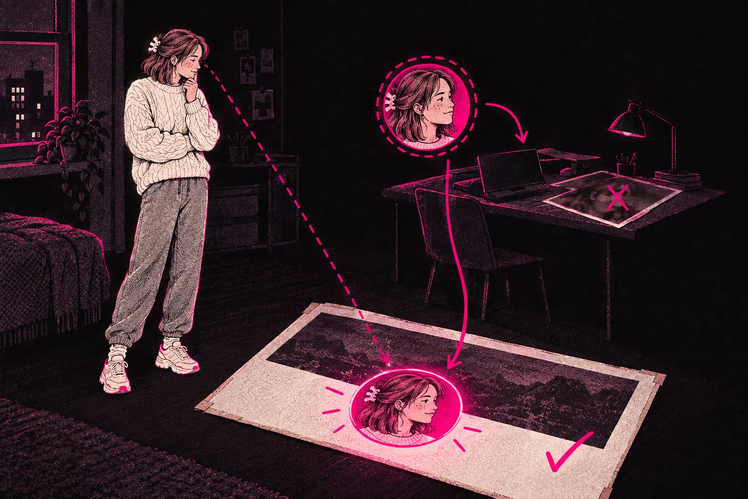
The best OnlyFans profile picture is a sharp, well-lit, tightly cropped image that still reads clearly at thumbnail size. Pair it with a banner that fits around it and matches the mood of your page. They’re the first two things a potential subscriber sees, before they read your bio or scroll your feed preview, and they’ll judge your page on them in seconds.
Being the most attractive person on the platform matters less than making a clear first impression that matches what your page actually delivers.
The technical specs
Before anything else, know what sizes you’re working with.
Profile picture
OnlyFans shows profile pictures as a circle. The upload size usually recommended is 400 x 400 pixels, though the platform accepts bigger images and scales them down. The picture appears quite small on most screens, so detail disappears fast. Simple, clear shots work best.
You can upload JPG or PNG files. Keep the file size sensible. A heavily compressed JPG will look blurry, but there’s no need for a huge uncompressed file either.
Banner image
The banner runs across the top of your page, behind your profile picture. The size usually recommended is 1048 x 300 pixels, and again, bigger images get cropped. On phones the banner shows at a narrower shape, so keep anything important in the middle and away from the edges.
The same file types apply: JPG or PNG. PNG is the better choice if your banner has text or graphics with sharp edges.
What makes a good profile picture
Clarity
At the size it’s shown, your profile picture has to make sense at a glance. A tight crop of your face or upper body works best. Full-body shots lose almost all their detail this small. You want someone scrolling through search results or suggestions to see straight away what they’re looking at.
Lighting
Good lighting makes a huge difference at small sizes. Bright, even light keeps your features clear. Dark or moody lighting might suit your brand, but if it turns your profile picture into a muddy blur at thumbnail size, it’s working against you.
Expression and energy
Your profile picture sets expectations. A warm smile says you’re approachable. A more intense or suggestive look sets a different tone. Neither is wrong, but the feel should match the rest of your brand. If your page is playful and fun, let your profile picture show it. If your brand is more mysterious and alluring, lean into that.
Ask yourself what would make someone tap on your profile instead of the next one.
Background
Keep it simple. At thumbnail size, a cluttered background just adds noise. A plain colour or a blurred background keeps all the attention on you.
What makes a good banner image
Complementary, not competing
Your banner should work with your profile picture, and it shouldn’t fight it for attention. Your profile picture sits over part of the banner (usually towards the left), so plan around that overlap. The right-hand side of the banner is the best spot for any text or extra visuals.
Setting the scene
The banner gives you room to say more about your brand than a single headshot can. Some creators use it to show off their style, some add a tagline or a promotion, and some use a wider shot that sets the overall mood.
Text on banners
If you add text, make it big and easy to read. Small text on a banner can’t be read on a phone, and a lot of fans will see your page on one. Stick to one short line, such as your tagline or a current offer, and make sure the text colour stands out clearly against the background.
Common mistakes
Using low-resolution images
A pixelated or blurry profile picture makes it look like you don’t take your page seriously. If you’re putting effort into your content, spend five minutes getting a crisp profile image.
Overcomplicating the crop
A common problem is trying to fit too much into a circular profile picture. Arms, accessories and bits of background all get lost or look cramped. Crop tighter than you think you need to.
Ignoring the mobile experience
Check how your profile picture and banner look on a phone screen. Hold your phone at arm’s length. Can you still tell what your profile picture shows? If not, simplify it.
Mismatched energy
If your profile picture has a casual, girl-next-door feel but your banner is dark and moody, the two don’t fit together. Your visuals should feel like they belong to the same page. Read our aesthetic guide for more on keeping your page’s look consistent.
Forgetting to update
Updating for the seasons, trying a fresh look and refreshing your images now and then keep your page feeling alive. If your profile picture is obviously two years old and your content looks completely different, that gap makes potential subscribers trust you a little less.
First impressions and decision-making
People decide whether to subscribe quickly. Research on visual processing suggests we form first impressions in a fraction of a second, and your profile picture carries a lot of weight in that moment.
Someone landing on your profile is asking themselves three quick questions, whether they realise it or not. Do I find this person attractive or interesting? Does this page look professional and put together? Does the vibe match what I’m after?
Your profile picture and banner need a yes to all three. You can get there without perfect photos, as long as you’ve thought about what each image should say.
Testing and changing your images
OnlyFans doesn’t have built-in A/B testing, but you can still experiment. Change your profile picture or banner for a week and see whether your profile views or subscriptions change. Keep notes on what you tried and what seemed to work.
A few things to keep in mind when you test:
- Change one thing at a time, so you know what made the difference.
- Give each test enough time. One day doesn’t tell you much. A week gives you a better picture.
- Think about outside factors. A dip in subscriptions might be seasonal and have nothing to do with your new image.
- Take screenshots, so you’ve got a record of everything you tried.
Tips for anonymous creators
If you’re making content without showing your face, your profile picture and banner need more thought, not less.
Profile picture options for anonymous creators
- A crop from the neck down that shows off your body or an outfit.
- A stylised or partly hidden image, such as a shadow, a silhouette or a shot from behind.
- A close-up detail that looks good without giving away who you are.
- An artistic or illustrated version of your persona.
Whichever you pick, the image still has to catch people’s eye. An anonymous profile picture should look deliberately mysterious. It shouldn’t look blank or unclear.
Banner strategies
For anonymous creators, the banner can do even more of the work, because nobody expects a face shot there. Use it to set your look, show off your body in a way that fits your brand, or create a mood with colour and composition.
Building your visual identity beyond profile images
Your profile picture and banner are the starting point, and they should tie into a wider visual brand. The colours and mood in these images should carry through to your content, your promo material and your social media.
If you’d like help pulling your visual identity and promo assets together, our creator kit has resources made specifically for OnlyFans creators who want to sharpen up how their page looks.
Quick checklist
Before you upload your next profile picture or banner, go through this list:
- Is the image sharp and high resolution?
- Does it read clearly at thumbnail size?
- Does its feel match my brand?
- Do the profile picture and banner work together?
- Have I checked how it looks on a phone?
- Is there nothing in the background that could give away where I live (if I need to stay anonymous)?
- Does the image match what my content actually looks like?
Get these basics right and you give yourself a much better chance of turning profile visitors into paying subscribers.